Uncanny Valley Review
I really wanted to like Uncanny Valley. Most of what it offers — a survival horror, narrative-driven adventure with retro visuals — are all attributes that appeal to me. It’s a shame then just how it all comes together, or rather how it tries to. Uncanny Valley has branching paths and endings throughout its short runtime, but it’s expected of you to play through it multiple times in order to fully grasp the story and secrets, which sadly, makes the whole experience feel jumbled and tedious.
I was determined early on though. There are choices to be made, some big and some small, that affect outcomes with characters and the story. My first ending in Uncanny Valley came swiftly and left me fairly unsatisfied, so I was keen to start back and learn from my mistakes. Unfortunately, the choices I made still funneled me back to the same section in the later half, which not only negates the main purpose of further replays, but also left a sour taste in my mouth.
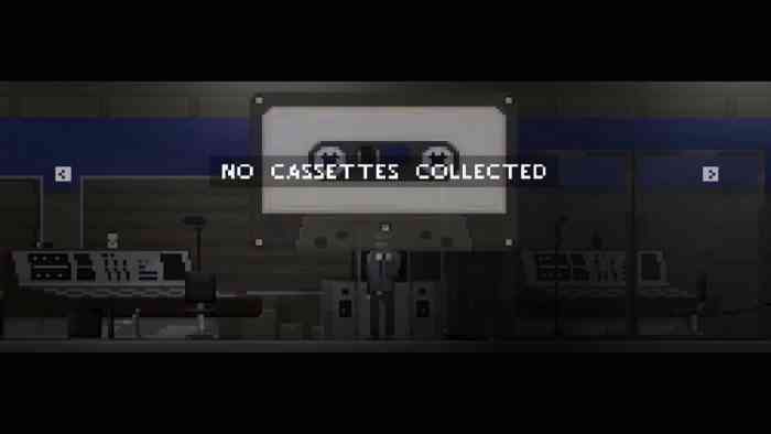
If there’s one thing that Uncanny Valley nails, however, it’s having an intriguing premise. This is accentuated with slick pixel graphics and smart sound design. You play as Tom, who has taken a job as a security guard at a remote facility. Tom appears to be looking for a fresh start, but through repeat playable flashbacks and nightmares, his past has seemingly caught up with him. You’re introduced to some offbeat characters, but a good chunk of the game has you exploring the facility, collecting cassette tapes and items, as well as reading employee emails before your shift ends and heading home to bed. This form of environmental storytelling is one of Uncanny Valley’s strong suits. Reading emails and listening to audio logs contains much of the backstory and helps establish an unsettling atmosphere, which for the most part, hardly lets up.
______________________________
“My first handful of attempts always led me to the same outcome, even when I thought I was doing everything right.”
The consequential gameplay is interesting at first, but it becomes a detriment when you’re trying to piece together the narrative. What could be classified as a “bad” decision isn’t apparent right away, and sometimes the consequence of that decision isn’t known if you’ve made other bad decisions as well. The game doesn’t suddenly end either, you’ll need to see through it to one of the many endings, which doesn’t sound nearly as interesting or as fun as you’d expect. My first handful of attempts always led me to the same outcome, even when I thought I was doing everything right. I ensured certain characters stayed alive and befriended them, I solved all the puzzles, I found all the clues — and yet the story still forced me down the same path, which in the end, made me question why I even bothered with another playthrough. Sure, one could argue “it’s about the journey, not the destination.” I don’t think that statement stands when talking about Uncanny Valley. It’s already a short enough experience, and the repeat playthroughs only muddle the story, making it nothing more than an incoherent mess.
That may just be my biggest disappointment with Uncanny Valley. Every ending that I saw never satisfied me. Each felt incomplete in their own right, almost as if developer Cowardly Creations was hoping players would go back and fill in the blanks themselves by making different choices. This creative decision isn’t bad when implemented well, but its execution in Uncanny Valley feels lackluster and needlessly complicated.

On the topic of being complicated, the control layout in Uncanny Valley on console was an element of frustration that I never got used to. Player movement is mapped to the d-pad and not the joystick, which already didn’t make for a good first impression. However, selecting items from your inventory IS done with the joystick, something that I felt was highly unusual. Furthermore, I was constantly confused with the ‘Interaction’ and ‘Pick Up’ buttons. Most games would map both functions to a single button, but not Uncanny Valley. Playing on Xbox One, I found myself rapidly mashing the A and RB buttons every time I entered a new room, simply because I wasn’t sure if a specific item needed to be picked up or whether I had to read some text to proceed. When the game itself can’t stay true to its own control scheme, its dumbfounding to expect players to figure it out. The frustration ramps up in the later part of the game when android enemies are introduced. I now had to learn how to defend myself, fire a gun, and heal my wounds, all the while battling with the above annoyances.
______________________________
“Uncanny Valley has strong presentation and an interesting story to tell but it’s held back by bad execution and cumbersome controls.”
Despite falling into the indie game trope, the retro pixel art graphics in Uncanny Valley are clean and surprisingly varied. I particularly liked the artwork near the beginning, jumping from dreary rain-soaked alleys before easing into an outside region with snow covered trees. My only complaint is that sometimes it can be difficult to read text (there are a lot of emails!), and that some items are occasionally hard to make out. Thankfully, they are outlined once you’re standing in front of them.
Uncanny Valley has strong presentation and an interesting story to tell but it’s held back by bad execution and cumbersome controls. The repeat playthroughs — while they do flesh out the story some more — didn’t make the game more enjoyable, but more frustrating as I tried to assemble a story that didn’t need to be told in a disjointed manner. Uncanny Valley has some cool surprises under its hat, it’s just a shame that most players may not have the patience to see it all through.
***An Xbox One code was provided by the publisher***
The Good
- Excellent presentation
- Great premise
The Bad
- Messy storytelling
- Repeat playthroughs aren’t fun
- Some choices don’t matter

