RWBY: Grimm Eclipse Review
Every now and then an indie game will just blow you away with it’s hidden depth, ingenious new mechanics or its unique eye catching art style. This is not one of those times, unfortunately. RWBY: Grimm Eclipse from Rooster Teeth Games, based on their popular animation series, is a solid if unremarkeable first effort from the new studio. For every positive attribute this 4 player hack and slash offers there comes a negative, resulting in a package that may only appeal to the most hardcore of RWBY fans. That doesn’t mean there isn’t fun to be had. I experienced brief of moments of joy during my playthough. Those moments simply got overshadowed by boring design.
RWBY: Grimm Eclipse has a thin story involving a malfunctioning security network that needs repairing while hordes of Grimm do what ever they can to disrupt your efforts but it’s just background noise really. For those that don’t watch the show, the world and characters will mean nothing thanks to the game itself lacking any meaningful character arcs or interesting world building. Let’s be real though, it’s a hack and slash. While a great story would be awesome, it’s not something most games of the genre put much stock into. So, I’m not going to either. Some of my favorite games of all time lack a good story.
__________________________
“The longer you play though, the lack of depth starts to show and things get repetitive.”
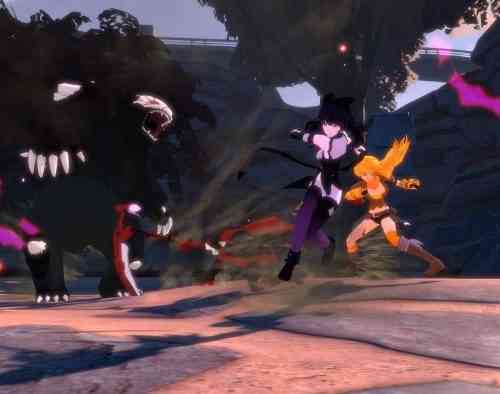
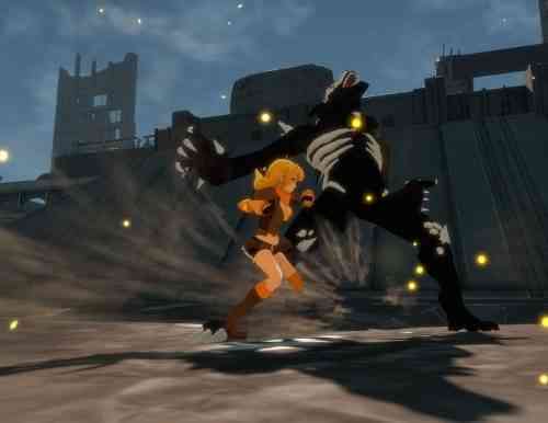
What matters, especially in a hack and slash, is the gameplay and this is an area where RWBY: Grimm Eclipse actually shows some promise in its opening moments but eventually stagnates. First thing I noticed was how responsive the game feels overall. Running, dodging, throwing fists of fury and firing off secondary weapons actually feels pretty good once you get the counter timing down. It operates like the now well proven Arkham series combat with simple inputs that result in flashy combos. Hitting counter when prompted will send your character flying across the screen, like two strong magnets colliding, enabling you to keep combos going even when an opponent seems out of reach. The longer you play though, the lack of depth starts to show and things get repetitive.
Upgrades to combos and useables are available and unlock via credits that are earned by gaining experience but they don’t affect the core gameplay enough to keep things feeling fresh. That said, some characters certainly are more fun to play as than others. Blake as an example has a cool trailing shadow effect when she attacks, making the combat feel even more frenetic than it actually is. Pyrrha was also enjoyable thanks to her ranged counter move which allowed me to hold numerous enemies back while I focused on pummeling one specifically.
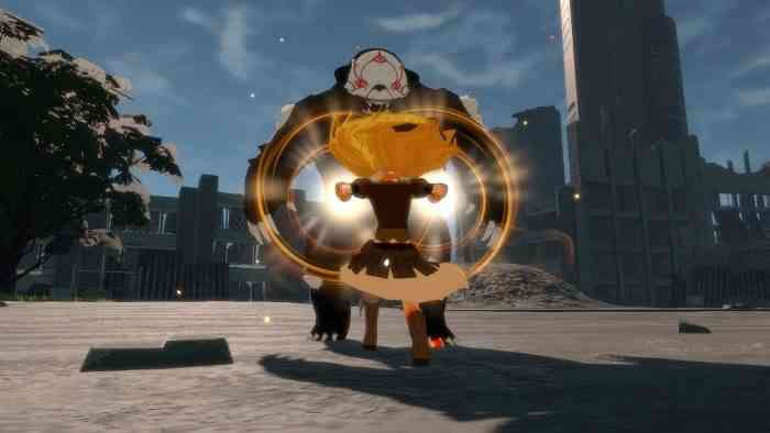
Speaking of the enemies, their lack of diversity becomes apparent way too early. You’ll mostly be fighting the same enemies in nearly every area and their artificial intelligence adds to the eventual tedium of battle. Not once did I see an enemy adjust to my play or try and use any sort of strategy. They simply charge and attack wildly. Well, they don’t all do that exclusively… a few of them block occasionally. That’s about the extent of their abilities.
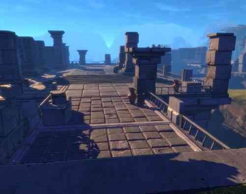
Each of the levels plays out nearly identical as well and this highlights the uninspired world design. Run along a lifeless linear path, stumble across the occasional hidden in plain sight collectible, drop into a pit with a security network control tower to defend and fight five waves of Grimm. Rinse and repeat.
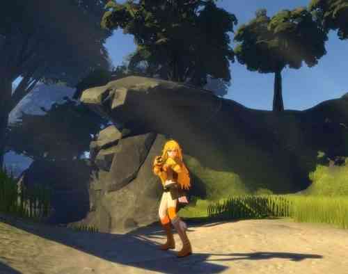
While the level design is certainly lacking, I do think Rooster Teeth Games did a good job on the overall art style. Sure, the environments are fairly bare bones but the character designs are mostly well done and the accompanying effects to each characters special attack were pleasing to the eye. Enough so that I always took a moment to pan the camera around each character to admire their designs.
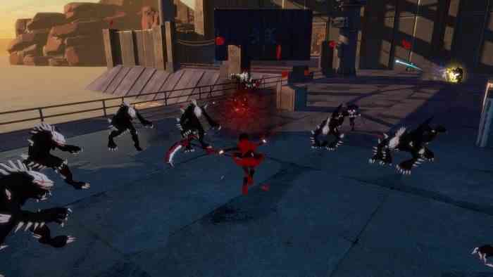
It’s just too bad that easily avoidable technical issues kept rearing their head. More than once I’d run into a single stair that couldn’t be run up, requiring me to leap over it and totally break my momentum and immersion. Enemies would also get stuck in place, with stuttering animations until you “activated” them by getting a little closer. I also had a end wave boss just stand in place, using only his most basic attack, allowing for an easy and equally boring climax to an otherwise frantic wave of enemies.
RWBY: Grimm Eclipse isn’t a bad game but it’s not a good game either. It’s just an okay game. Aspects of it show promise and that the developers at Rooster Teeth Games are capable of delivering a fast paced action title with responsive controls. They just need either more time or perhaps a bigger budget (maybe both) to deliver on their potential. Level design, enemy variety and general quality assurance being the areas in need of the most attention. While I didn’t love my time with RWBY: Grimm Eclipse, I am certainly keen to see what Rooster Tooth Games does next.
***A PS4 code was provided by the publisher***
The Good
- Fast & responsive gameplay
- Cool character designs
The Bad
- Uninspired level design
- Boring combat scenerios
- Lack of depth
