Horror of the Deep Preview
Horror of the Deep is a descent deeper and deeper in a vast labyrinth of decrepit dungeons and castles. Described as a rogue-like experience, Horror of the Deep manages to be reasonably fun in its early stages, but it’s nothing spectacular.
As for my playthrough, I’d say this is a hit-or-miss experience. It is presented as rogue-like which obviously fine, but because of this fact, I felt it lost some of it’s atmosphere, and seemed to contribute to its crushing difficulty. I played around 3 hours of the current build before I’d experienced all that is currently available. There is a huge amount of empty rooms, with many looking identical to the last dozen or so I walked through, and the majority of the gameplay boils down to finding keys, or avoiding enemies.
There is no real story to speak of. Everything feels little more than just stages of challenge rooms, with a few meaningless bits of text splattered about to give some semblance of substance as to why your character is there. This may be due to the fact the game is in its alpha stages; however, it seems the game has plenty more that needs to be added before it is considered complete.

Control-wise, it needs work. It is a typical first person affair, although the lack of a defined ‘body’ within the game, as is the norm with many games using the Unity engine, is a concern. Everything feels a little too ‘floaty’ and the lack of any combat system further highlights how poor the controls are. This being said, this is something I’m sure can be worked on throughout its early access stage.
Enemies are roaming the dungeons as well as yourself, though few of them will do anything other than stick around for a few seconds to provide a cheap jumpscare, while others will instantly attack and kill you. I found it fairly easy to avoid these enemies as the general AI seems to be a little on the slow side.
__________________________
“For a Unity based game, it looks fairly good, without being anything particularly spectacular.”
Currently, there is not much variety in terms of the gameplay. As I touched upon earlier, most tasks involve simply finding several keys to a door, rinse and repeat.
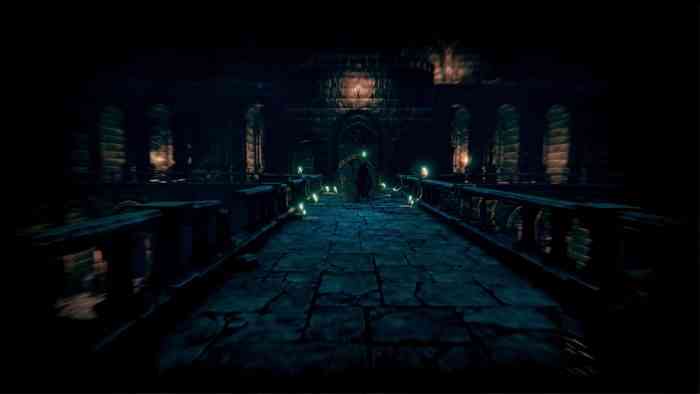
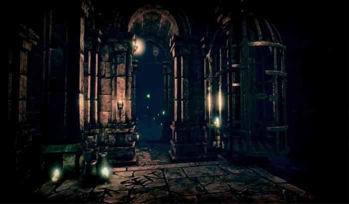
For a Unity based game, it looks fairly good, without being anything particularly spectacular. I did; however, dislike the font that is used in the game. I found it hard to read and generally irritating as it pops up frequently. This may be a personal preference thing as I’ve seen a few people on the Steam forums that like the creepy aesthetic of the font. Enemy design is a little on the generic side too. You’ll find nothing in the same league as The Evil Within or Dead Space here, which is unfortunate. The environments; however, do look very good and the overall creepiness definitely shines.

The audio design is well done, and the music score is definitely well implemented. Jump scares require the use of loud musical stings that achieve their goals of startling the player. There is no real dialog in the game and the general lack of any real player feedback is a let down but this may be a limitation of the engine itself and of course, this is something that could be addressed later in development.
I do see potential for Horror of the Deep. Yet in its current state it doesn’t really offer anything new or exciting to the genre. Once again I must stress that this game is in early access, so hopefully many of the issues with the current build may be addressed further along in development.

