Project Highrise: Architect’s Edition Review
Project Highrise, first released on PC in 2016, brings tower building and management to the Switch in an enhanced Architect’s Edition that includes DLC and content packs as well as the original base game. It’s a solidly-constructed little title built on a solid foundation, but its uninspired presentation unfortunately keeps it from reaching great heights.
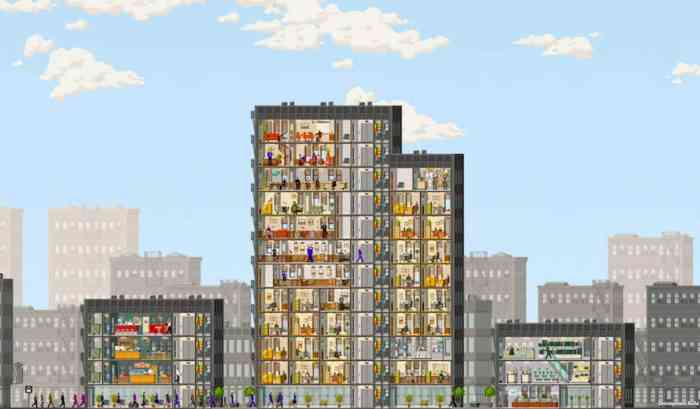
It has been said that Project Highrise is a spiritual successor to 1994’s Sim Tower, and that’s an understatement. A cynic might even call it a clone, as its look and gameplay are very similar. Like Sim Tower, you have a cutaway view of your growing structure showing your residential and commercial tenants, as well as the electrical, water and other infrastructure that keeps everyone happy and paying you rent.
It’s an ably-built game based on a proven sim formula, and developers SomaSim pack it with lots of content, including a wide range of building options, lots of game modes including scenarios and free-build, and tons of management tools to make you feel like a real building manager. The user interface is also really intuitive and it’s easy to jump right into the core experience from the start, even if you haven’t played many of these kinds of games before.
Cracks in the Foundation
But even with all the positives, there’s something profound missing from Project Highrise. It’s boring. And it’s hard to say exactly why, because as I said there’s lots to be positive about on the surface. Maybe it’s the visuals – it seems as if the developers were trying for a minimalist style, with a limited color palette and simple renderings of people and items. But it’s too minimalist; even after I had built a 10-storey tower with lots of residents and businesses, it still felt deserted, unpopulated, lifeless. It was hard to care about the residents of my burgeoning community when all I saw for the most part was empty rooms and hallways.
The experience also feels constantly constrained, which takes away the “god mode” fun that the best sim games give me. You are limited in what types of units you can build by the width of the level, so placing new units becomes almost a puzzle mini-game as you find a way to fit various 3 and 4-tile units in such a way as to maximize space. There always seems to be an orphan tile left over, though, no matter what you do which makes for some ugly, imperfect levels that visually bothered me. Project Highrise, like Sim Tower before it, lacks the wide-open freedom you feel in a game like Sim City because in this game, you’re essentially limited to building a city that’s confined within one narrow strip of land.

I learned the hard way that you have to take Project Highrise slow – giddily build your tower up too fast, like I did at first, and you’ll find yourself in financial hot water pretty quick. That’s because as you build, you face more infrastructure costs – somebody’s gotta pay for all that electricity and cable TV – and your rent income won’t keep up. I don’t fault the game for any of this (they could be a bit more generous with the amounts, but whatever), but the bottom line is that in order to play the game as it was intended, you need to be cautious and do a lot of waiting and watching – and as we know, this isn’t a game where there’s much to watch during downtime.
To be fair, some bonus objectives are included to help augment your income, but they weren’t quite enough to keep me from constantly adjusting my building to keep out of the red. Thank God for all those informational reports the game gives you, because I found myself using them a lot to find out how the hell I could make this place profitable. After a very inviting and easy start, Project Highrise’s middle and late game becomes much more of a challenge, and I dare say a bit of a slog.
There’s lots to do in this game, there’s lots of challenge and it all works pretty smoothly. But Project Highrise just feels flat and never achieves the “just one more turn” level of addiction that I love in the best sim titles. Despite its strengths, including the extra content in the Architect’s Edition, there’s a certain je ne sais quoi that’s lacking – be it color, humor, variety, what have you – that had me just wishing I could hang up my hardhat after not too long.
** A Switch game code was provided by the publisher **
The Good
- Easy to learn and play
- Nice user interface
The Bad
- Uninspired presentation
- Management becomes a chore
- Experience feels constrained

