The 5 Worst Things About Cyberpunk 2077 (and What Can Be Done About Them)
The most anticipated game of the year has finally arrived and… well, to be honest, was not really worth the wait. Cyberpunk 2077 launched with a whole multitude of problems, most of which CD Projekt Red (CDPR) has acknowledged. Since launch, there have been a number of hotfix patches released and slowly the game is becoming more and more playable. Plus, there are more fixes on the horizon, including two big updates in January and February, as well as the much needed “next-gen update” which will improve the visuals substantially on PlayStation 5 and Xbox Series X.
Originally I was going to write an article sharing the three things we loved and three things we hated about Cyberpunk 2077, but as I continue to play and discuss the game with my colleagues, it’s become more and more apparent that there really isn’t much to love about Cyberpunk 2077, aside from a few neat characters and a story that has some interesting moments. So, this article has evolved into a list of what I believe are the worst aspects of Cyberpunk 2077, and suggestions on what could be done to improve them. Before we get started, I want to mention two things. First, I don’t want this to come across as me kicking CDPR when they’re down. I completely understand there were a lot of internal and external circumstances that have made the game’s development challenging. I also believe that Cyberpunk 2077 has the potential to be a substantially better game. Two, this list is not exhaustive, and I’m confident many players will have other areas of Cyberpunk 2077 they’d like to see improved. And with that, let’s get started.
1. Visuals
Cyberpunk 2077 is in the difficult position of trying to look good on both the previous consoles and the brand new consoles. It makes sense from a financial standpoint, CDPR is just trying to capitalize on consumers still enjoying their Xbox One’s and PlayStation 4’s. Unfortunately, the end result is a lot of unhappy consumers demanding refunds. Cyberpunk 2077 looks just awful on Xbox One/PS4 and ultimately, these versions should have been canned and focus placed exclusively on PC and next-gen consoles. The Xbox Series X/PS5 versions do perform substantially better, however, they don’t embrace any next-gen qualities like ray-tracing. Eventually, CDPR will release a “next-gen update” for PS5 and Xbox Series X that will make better use of their next-gen hardware, giving us the game we should have received from the get-go. We can’t go back in time and change the past, but in retrospect, CDPR should have delayed the game until the next-gen versions were actually ready for the spotlight.
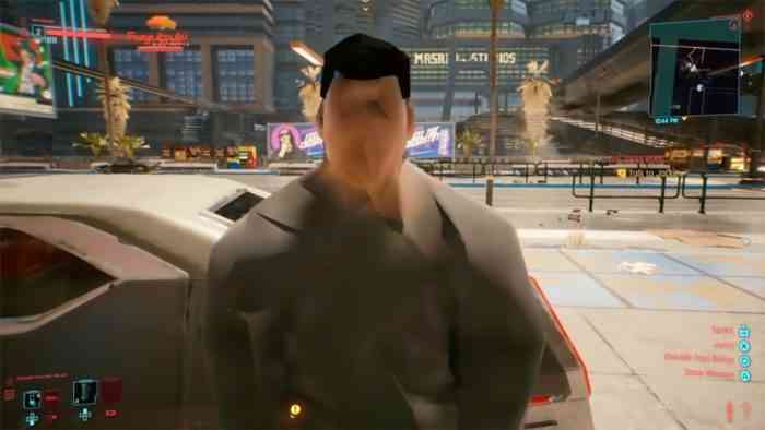
The Ripperdoc suggests: While we await CDPR’s next-gen patch, there are a couple of settings users can tweak to improve the look on next-gen consoles. In Settings, under Graphics, turn off Film Grain and Chromatic Aberration. In Settings, under Video, flip the Frame Rate Mode to Quality. These modifications will give you the best looking and smoothest gameplay for the time being.
2. Menu Mismanagement
Who would have thought navigating menus in a game would become a full-time job? In Cyberpunk 2077, it is. I’m not going to break down all the in-game menus – trust me, I originally did that and it ended up looking like a massive wall of painfully constructed text. There’s just no way I can be concise about Cyberpunk’s menus, and therein lies the problem. This game is so deep you’re likely to drown just trying to figure out all the different systems and subsystems. The Character menu – where you tweak your abilities – has a bunch of Attributes and Perks you can fiddle with. Yet all these perks and attributes just add minor, incremental enhancements that really don’t add much to the overall game. The Inventory is a disorganized joke with non-sensical icons denoting each item category. The Journal is an ever-growing honey-do list of missions you can tackle. The Map is a disorientating Jackson Pollock painting. And finally, there’s Crafting, which after all my time with this game, I still have zero idea how it works. In talking with some of my colleagues, they rarely, if ever, used Crafting either. To compound this problem, the menus use a cursor system – which makes sense if I’m using a mouse and keyboard – but is a pain in the ass when using a controller.
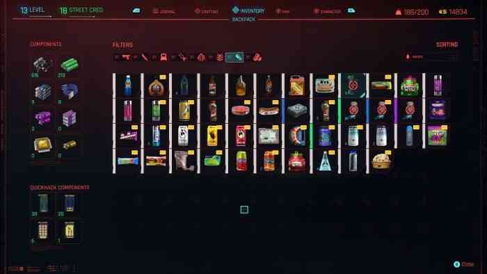
The Ripperdoc suggests: First, scrap the Crafting component, it’s useless. Second, add proper tutorials for absolutely every aspect of the menu. And no, not those stupid on-screen prompts that show up at the worst possible moment or the “help” option that displays vague information on screen. I want full tutorial videos that I can watch within each menu that clearly lays out what everything does and how I can get the most out of this game. And finally, drop the annoying cursor navigation and come up with a system that works well with a controller.
3. The B/Circle Button
In Cyberpunk 2077, the B/Circle button has double-duty. During gameplay, the B/Circle button is used to crouch/stealth mode and to skip dialog, cutscenes, and driving sections. More often than not, I find I’m accidentally skipping dialog simply because I intended to go into stealth mode while I’m on a mission and one of my companions is talking. What’s worse, the “B/Circle to Skip” prompt is CONSTANTLY popping up on screen. Every time someone talks to me, it pops up. Every time I’m a passenger, it pops up. Every time I’m watching a cutscene, it pops up. To me, it’s the devs way of saying “we don’t care about the dialog or cutscenes, please just skip it”. There is a way to remove the “B/Circle to Skip” prompt from appearing on screen, however, in doing so, you’ll also remove prompts for all the other in-game controls, such as driving controls – something I actually do like having on screen at times.
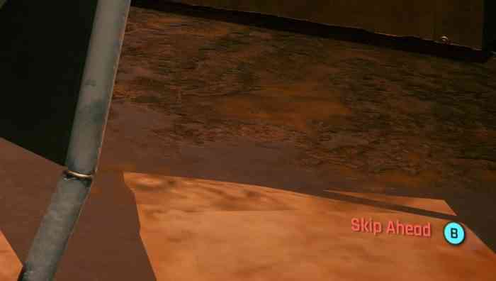
The Ripperdoc suggests: Two things for CDPR to do here. One, they need to add separate setting to turn the “B/Circle To Skip” dialog on or off. This will allow us to keep in-game controls on screen while not having to be prompted to skip every time we’re engaged in conversations. Two, provide an alternative way to skip dialog, driving sequences and cinematics. I have two recommendations for this; either “Hold B/Circle to Skip” or “Double-tap B/Circle to Skip”. In fact, why not just add both options and let us choose which of the three options, Tap, Hold, or Double-Tap, in the setting’s menu.
4. Loneliness
I find the world of Night City can either be adequately populated or completely barren. There are times I’ll be driving for lengthy distances with not a vehicle in sight. Or I’ll walk through markets with no NPC characters around. It’s not all the time, mind you. But it would be nice to see a more evenly populated world. But more than this, I’d like to see better interactions with NPC characters. Every character allows me to talk to them, yet the conversation is always them saying a random phrase with zero baring on anything. There is an opportunity for even more immersion, because right now, it’s just the bare minimum.
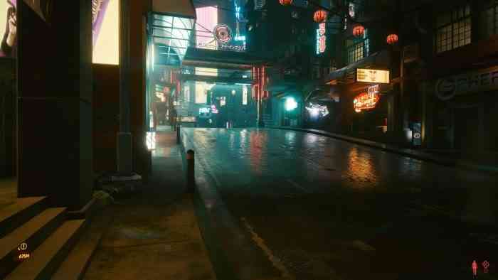
The Ripperdoc suggests: A good start for NPC characters would be to designate them with different, randomly assigned personalities. For example, homeless NPCs that ask for spare change, drunk NPCs that want you to share some liquor, or flirty NPCs that will try using some corny pick-up lines on you. There’s really no limit to the different type of personalities – but make sure they have some level of interaction too. If you say no to the drunk, maybe he’ll try and start a fight with you. If you respond to the flirty NPC with the right response, maybe they’ll ask you on a date. And what would the point of a date be? Well, that brings me to the next aspect of interactivity; businesses. We need to be able to go into certain businesses and actually engage with their product. I should be able to sit down at a restaurant and order a meal. I should be able to go to an arcade and actually play a mini-arcade game. We’ve been having these types of interactions for well over a decade in other open-world games – CDPR just needs to make it happen.
5. Sexual Content
Now, don’t get me wrong, there is nothing wrong with nudity, sexual content, sexy characters and/or sexual innuendo in games. These things are a part of life and it only makes sense they’ll seep into our video games. This content does not need to come across as seeming pornographic. If game devs can sneak a clever sex pun into an in-game advertisement, great! If a sex scene can break up a game’s monotony – just like it does in movies – then why not? With that said, I found that CDPR infused almost too much sexual content into Cyberpunk 2077. It seems like every damn in-game advertisement has some sort of sexual reference to it. And it’s not subtle. It’s blatant, in-your-face, over-the-top sexual content – there’s no wink, wink, nudge, nudge, know what I mean? Now, don’t get me wrong, I don’t want any of the content removed. I applaud CDPR for at least trying to be sexy and edgy since a lot of games have strayed away from sexual content due to backlash from some gamers who feel uncomfortable with sex. What I’m simply asking for is balance.
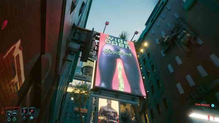
The Ripperdoc suggests: It seems like most in-game advertisements appear at random – changing each time I re-enter a location. This is a good thing. This helps keep the environment feeling fresh. My suggestion would be for CDPR to hire some clever comedy writers or an advertising agency and have them create some brand new ads to cycle into the mix. Make these ads more interesting. Maybe less of a focus on sexual content, or at least be more clever in the sexual innuendo execution. Instead of a snake slithering between two legs, show a snake wrapping itself around a leg. Same message, but one is just a bit less on-the-nose.
And that concludes our look at the 5 biggest issues I believe are holding Cyberpunk 2077 back from being an even better game. Improved visuals, better menu management, some tweaks to the controls, a more interactive world, and a more subtle approach to sexual content all will make the game feel like a better overall experience. I’m confident that by next summer, CDPR will have improved Cyberpunk 2077 significantly and it’ll feel like it should have when it originally launched.
Thank you for keeping it locked on COGconnected.