I wouldn’t describe Ride to Hell: Retribution as boring. Apocalyptically hideous, yes, but dull? It’s simply too jaw dropping to be equated with watching paint dry. Games in that category of bad, are more like watching a painter’s brush explode into alien goo, followed by an actual alien coming down to eat it and fly through the stratosphere. They’re so out-there, so unlikely to be seen, that they’re almost beautiful in an ironic way. But boring is exactly how I would describe Into the Stars with one word.
Had this game take more notes from Ride to Hell, Big Rigs, or Garry’s Incident, I would’ve been able to get some comedic joy out of watching a team of developers commit digital seppuku. Into the Stars also could’ve been an exciting budget price game, with an open ended exploration of space, vast content, and variety to encourage multiple play-throughs. Instead, Into the Stars is a disguised re-release of Oregon Trail from four decades ago.
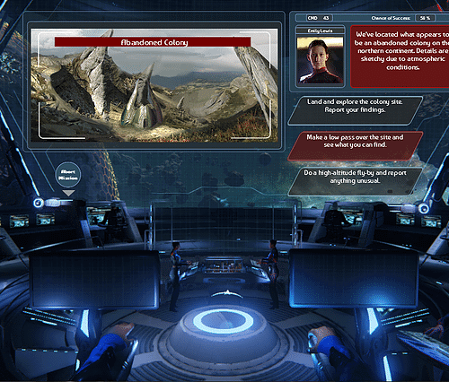
Normally, I’m not a fan of simplifying game concepts by comparing with others. Skyrim with guns! Matrix meets John Woo! Cowboys in Space! But calling this game Oregon Trail in space really doesn’t feel like an exaggeration. A to B objective? Check. One-dimensional mini-game? Check. Disseises, damages, and death received for no reason other than the game flipped a coin? Check!
______________________________
“Even when you get past the halfway point with people dying, and resources draining, there’s no tension because you’ve done everything you can, and you’re just hopping that the next planet or ship you stumble upon has something of use.”
Any idea of this game being a rewarding demand of skill is thrown out the window the moment your shuttle blows up and kills your pilot despite having a 95% success rate on your tenth day of space travel. Of course, it’s acceptable back in 1971 for gameplay like this to occur, but in a time where I’ve seen more advanced projects made in Adobe Flash, witnessing design tropes this shoehorned boggles the mind.
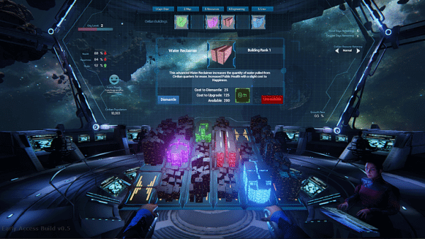
But I don’t want to keep Oregon Trails comparisons in every paragraph, because the issue isn’t so much that these tropes are old, it’s that they don’t make for interesting gameplay scenarios. Deciding how to deal with a ship-fire is exactly the same as dealing with an Alien species that wants you to join a pod-race; you select one of three choices, and the game tells you if you picked the right one. This old-school style of random events is combined with real-time ship piloting as you manually control your spacecraft, while balancing your resources, and playing Civilization Lite with your ship’s inner city. This might’ve been interesting if there was lots to do while balancing all of these things, but there really isn’t. Even when you get past the halfway point with people dying, and resources draining, there’s no tension because you’ve done everything you can, and you’re just hopping that the next planet or ship you stumble upon has something of use.
Input and expression from the player is kept to a minimum, as the majority of playtime is spent watching your ship move forward, while you get one notification about something that needs fixed, to which you assign a crew member to solve it and a few minutes later it’s always solved.
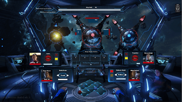
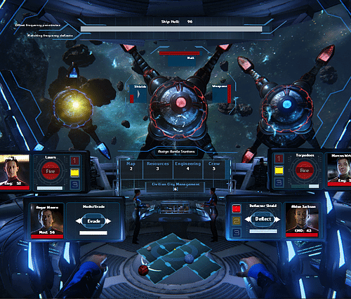
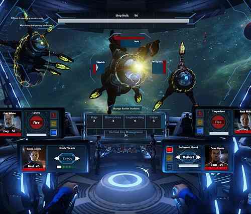
Combat? What combat? Oh, the combat that feels like Punch Out on Ambien and features less depth? Yeah, it had me on the floor stabbing an electrical socket just to make something happen. It’s pseudo real-time combat where the enemy telegraphs their moves, and you either dodge or block it, and follow it up with your own set of attacks, meanwhile ships are in a staring contest until one of them explodes. There’s really not a lot to it. Sometimes, there can be a little bit of a buzz while you sneak past enemy fighters, but whether or not they spot you is very inconsistent, and it doesn’t feel intentional like the rest of the game’s reliance on number generators.
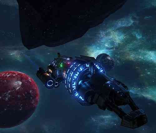
Graphically the game is decent, but features a below average user-interface. 3rd person view doesn’t allow you to see real-time information, restricting you to the cock-pit view, where the game has to perform the same animations for screen-swapping and captain’s chair displays every, single, time. I don’t know if making the player wait for a screen to load when switching was also intentional, because it’s presented more like a texture load. It doesn’t ultimately matter which it is, because within minutes the mere act of switching menus becomes tedious.
Everything else from the sound design, to music, voices, and effects are about as generic as Sci-Fi gets, there’s nothing alluring about the galaxy crafted or any of the races you face. Most of them don’t get any more than a sentence written about them, and the context the player is in doesn’t leave much room for giving a damn, you just care about whether they’re going to shoot your ship and demand you give them slaves, or hand you upgraded shields for free.
At the end of the day, Into the Stars is exactly what you would expect from the phrase “Oregon Trail in Space”. Those who enjoy managing resources and exploration, may find something that deserves their attention, but poor U.I, lame combat, and Anime league pacing is going to leave many wanting more from the experience. Bad? No. Bland? Yes!
***A PC code was provided by the publisher***
The Good
- Decent Space Graphics
The Bad
- Clunky User Interface
- Dated and Conflicting Design
- Lack of Depth

