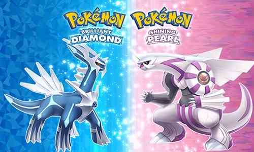
Pokemon Brilliant Diamond and Shining Pearl Review
Pokemon remakes are strange beasts at the best of times. The series’ evolution comes in fits and starts, with only a handful of features surviving multiple generations. This leaves modern versions of older games (like Diamond and Pearl) feeling strangely anachronistic. That said, Brilliant Diamond and Shining Pearl make less sense than any Pokemon remake I’ve ever played. Don’t get me wrong! This is a polished, smooth, accessible experience, one that mostly does justice to the original release. I just can’t wrap my head around the visual language on display. The three distinct aesthetic visions create a jarring, confusing final product.
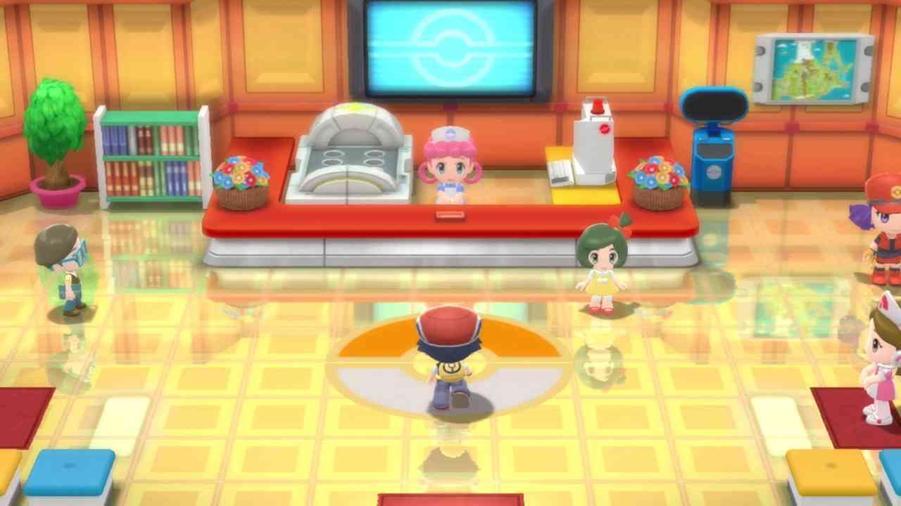
The three styles might not be immediately apparent. Everything looks pretty uniform at first. The standard overhead view is a 3D version of the original style, with a whisper of tilt-shifting and some upgraded model designs. But then a cutscene happens, and you suddenly get a close-up look at these chibi character models. It’s instantly off-putting. The original versions of these characters were meant to be viewed from a respectable distance. You can’t just put the ‘camera’ a couple feet away and not have it look extremely weird. Everyone you meet looks like a keychain collectible up close. Of course, once you’re in battle, these adorable models are replaced by normal-looking characters. This actually follows the original game quite closely, with the exception being the zoomed-in chibi view. It truly never gets less weird. Somehow the music follows this same formula, by the way.
What Is Even Happening, Visually
Brilliant Diamond and Shining Pearl have a dense, layered soundtrack that I can’t reliably distinguish from the original release. Although the instrumentation is more complex, the style and the execution is somehow identical. This leads to music that sounds fine but feels weird. It’s almost as if they took the masters from the DS games, and ported them directly to the Switch. The effect is mostly harmless, with one significant exception. Every trainer battle is kicked off with a brief musical interlude, one that differs depending on the kind of trainer you’re facing. These tiny songs are almost uniformly insufferable. It’s like they crammed 90 seconds of song into a six second track. Between the music and the visuals, it’s hard to get a read on these games.

Maybe I’m not being clear enough. There’s something so odd about seeing your chibi character walk over a polished floor, their reflection moving with them. Conversations between two characters take place without a single change of expression. Your mother sends you off on a giant quest, her glassy eyes fixed and frozen. You look like a capsule machine prize, but your shadow is animated and fluid. The outdoor scenes use a touch of tilt-shifting, while the textures are jagged and sparse. Battle models are full of life, while the chibi versions are pure driftwood. Shops and Pokemon centers all have detailed door animations for some reason. The developers took great pains to achieve this exact aesthetic, and it utterly baffles me.
Pretty Fun Game Under All That
Strange aesthetic choices aside, the gameplay is rock solid. The core formula is mostly unchanged from the originals, which is honestly great news. Generation four is right when they started cramming these games full of wacky features. Things like multi-gear bikes, underground tunnels, beauty contests, and secret bases all help keep you engaged. On top of that, experience sharing is the default setting now, which I wholeheartedly approve of. Never again will your only viable type matchup be 15 levels too weak, even though they’ve been with you since the second town! I haven’t played these games since their original release, which means I’m constantly remembering more cool features as they come up. There are new elements I’m not at liberty to discuss, but just know that they’re the icing on an already delicious cake.
On the flip side, I’m not sure who this release is for. If you’ve never played Diamond and Pearl, you’ll probably love these games. Assuming you don’t mind a couple of tiny steps backwards in terms of mechanics. If you’re familiar with the old games, this will be a mostly pleasant nostalgia trip. Especially if you’ve forgotten everything that happens, like me. The only hitch is the baffling visual and audio design. More than anything, these choices suggest that the Pokemon Company isn’t exactly sure what fans want out of these games. Brilliant Pearl feels well-crafted yet confused, like they pursued several disparate visions at once. If you can see past these strange decisions, you’ll find a set of pretty respectable Pokemon games.
***A Nintendo Switch code was provided by the publisher***
The Good
- Upgraded battle visuals
- Modern mechanics and features
- Gameplay is smooth and seamless
The Bad
- Baffling visual design
- Certain songs are grating
- Target audience unclear

