They Had No Shortage of Ideas
Anyone who has been visited any gaming news websites or been a fan of the Borderlands series has probably seen the Borderlands 3 box art by now. The messianic psycho with three fingers raised and surrounded by roses with the characters’ faces is what we will see when players launch the game. What fans may not have known is that there were a lot of options for Gearbox to choose from. At SDCC, the Museum of Mayhem displayed many alternate Borderlands 3 art works that we could have seen on the cover. They were posted on Resetera by vestan.
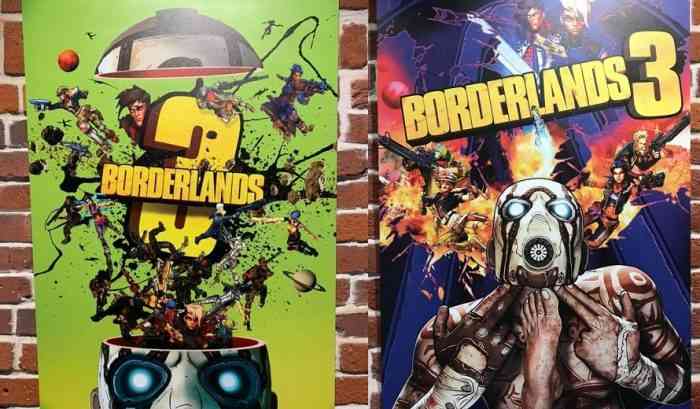
Many of the art displays reached various levels of polish before ultimately being scrapped for the one we will get. As you can see, Gearbox did explore the option of having a third appendage blasting the psycho, in line with being the third game.
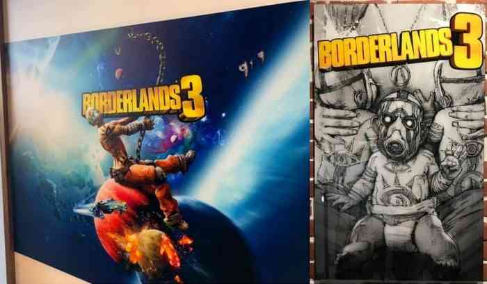
The Borderlands games often like to mirror pop culture of the real world. The image on the left is a clear reference to the Miley Cyrus’s Wrecking Ball music video, while the one on the right is… a few baby psychos breastfeeding?
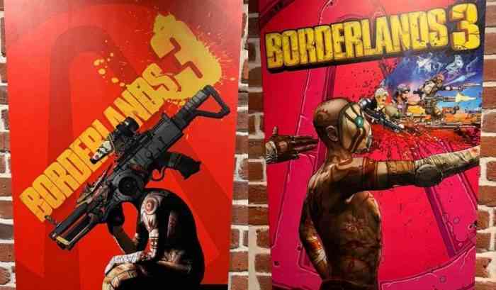
Again, referencing pop culture, the one on the left is the Borderlands version of the Thinker statue by Auguste Rodin with a gun instead of a head. The one on the right explores the three-fingered finger-gun that you will see in many of the alternate box arts.
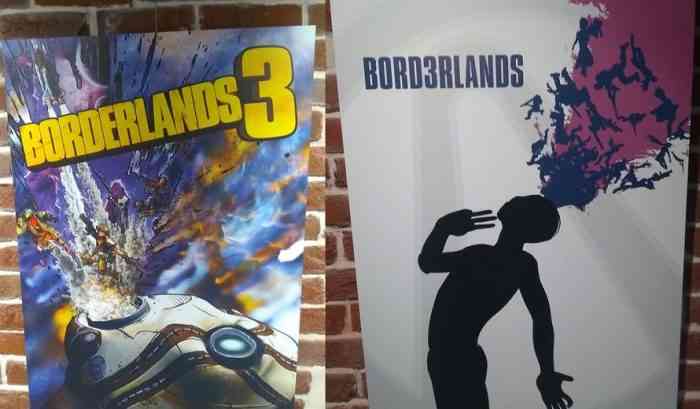
These two are more examples of the classic Borderlands motif of blasting characters and images out of the psycho. If you’ll notice, the one on the right stylizes the title as Bord3rlands. Perhaps this was one of the earliest pieces.
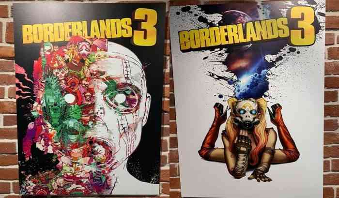
The one on the left does not exhibit any recognizable characters like the others do. This also might be a very early piece of concept art. The one on the right has a lady psycho in heels, which reminds me of Harley Quinn. Maybe that’s what they were going for in the Suicide Squad-hype days.
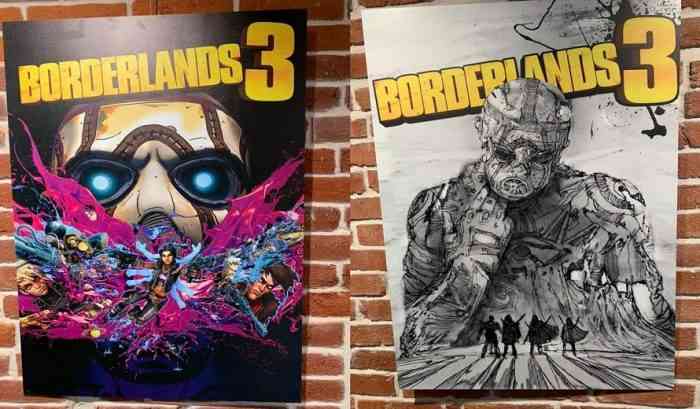
The fully coloured one uses character art identical to some of the others. This suggests that these had reached the same level of polish and were very close to being the chosen box arts. On the other hand, the one on the right lacks all colour with the exception of the title. The Vault Hunters also do not at all resemble the new ones so this may have been very early concept art.
Which one is your favourite? Let us know in the comments below.
Source: Resetera