At the Gates Review
At the Gates is the debut title by Jon Shafer and his 2013 founded company, Conifer Games. Jon’s history in modding Sid Meier’s Civilization III brought him to eventually work with Firaxis where he served to design for Civilization IV and its expansions, which made the conception of At the Gates a compelling project. The project came to be with the aid of a Kickstarter that has been working since February 2013 to fund the game, which, after exceeding many fundraising goals, finally came to pass. The game we have today has been long anticipated as it was hailed as a simpler, intuitive version of the Civilization games.
We start At the Gates during the fall of the Roman Empire. You have the opportunity to play as all of the barbarian tribes, though in the beginning, you can only play as the Goths. The tribes unlock as your gain reputation to either align with them or destroy them, ultimately leading to your victory against Rome.
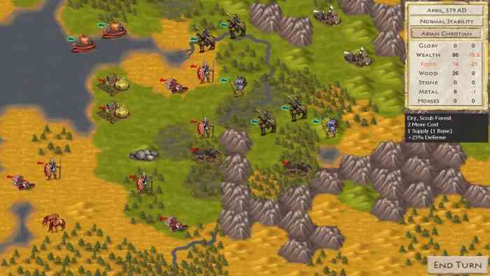
At the Gates plays like any other hex-grid-style map-conquering strategy game where the goal is to expand your borders into other kingdoms. You strategize how to build resources, fight off opposition, and conquer other lands. Coming into At the Gates, it’s best to not assume that there would be rapid rewards, and the game itself tells you as much in its initial tooltips that guide you through starting your settlement. This is all about the long-game and dealing with the frustrations of not being quite strong enough to fend off bandits or other armies. Oh, and don’t get too attached to your clans. They will die. Just keep working at it.
The gameplay of At the Gates can be remarkably frustrating and isn’t as intuitive as it should be, even as a Civ player. I found myself hung up quite often on how to actually understand all the ins and outs of everything. It’s completely mouse controlled, which is fine. With only a few keyboard needs and a complete lack of need for quick reaction time, it’s easy to control. The simplicity of the controls are misleading.
Frustrations Aplenty
The interface is where we see the most issues. The help files are fairly robust, but clunky and hard to navigate. There are no real instructions on things like how to build your structures like logging camps and ranches (which I still haven’t figured out and I’m super annoyed with). Buttons that exist in some places like for logging camps (I can tell if I can build a camp or not because the button is grayed) don’t exist for ranchers, so I have no idea if I can build a ranch anywhere. Also, having to learn the hard way that I need to keep my low level scout classes (reapers, gatherers, diggers, etc.) to identify nodes for my higher level classes (farmers, gardeners, miners, etc.) to figure out where to set up structures was really frustrating.
Additionally, the interface relies heavily on tooltips that provide walls of text of information that can be hard to read, especially when you need to deep dive into parts for expanded information. Often times I still wasn’t able to find the answer I needed in order to figure out how to maximize what I was doing. Also, being able to open multiple windows and move between them like the Professions list and the caravan window posed some major time-sinks for me. Not having a windowed mode was a major deterrent for me.

Graphically, though, despite the fact that the interface is clunky, At the Gates features a watercolor design that I really liked. The paintings used are pretty and perfect. That map is pretty, too. It’s a big reason why I kept playing. As a Civilization fan, it was nice to see a design that felt more like the time I was playing within. I found it to be almost immersive, which is nice.
The music is just as appropriate, as were the sound choices, though I mostly played this on mute and allowed my own music to stream in the background. Fortunately, At the Gates doesn’t rely much on audio clues, so you can listen to podcasts or music to your heart’s content and not miss out on anything within the game.
Even with my frustrations with the interface, the game itself made me want to keep going. I credit the style of gameplay and my total need for world domination for that. Anything related to the Roman Empire is compelling, but even though I sank 14 hours into this game, I didn’t even get strong enough to unlock any of the other clans. I got closer, though, with each restart, but in my last playthrough, I found myself stuck because right after creating a fishing and galley joint army to begin an exploration mission, my game crashed. I tried returning to the previous save, but it won’t allow me to play in that Kingdom again. So I suppose, my conclusion is that the game has a lot of potential and I intend to keep playing it. I get the feeling that a lot of this will be worked out in time.
*** PC code provided by the publisher ***
The Good
- Compelling story
- Watercolor graphics
- Easy controls
- World Domination
The Bad
- Really clunky interface
- Walls of Text
- No tutorial
- Steep learning curve
- Still very buggy

