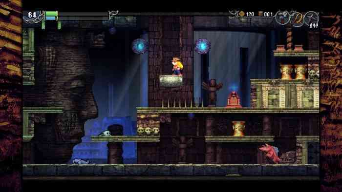
La-Mulana 2 Review
I’m confused. I’m confused by the positivity with which La-Mulana 2 has been received. Why do people like this game so much? Has the world gone mad? Is it nostalgia from the original’s cult following? If that’s the case, then I must have been out of the room when the La-Mulana Kool-Aid was being passed around because I honestly cannot conceive of the source of its popularity. In truth, there was very little that I enjoyed about La-Mulana 2 and very much that I didn’t. I can’t touch on all of the issues in this one review, so I’m going to focus predominantly on issues with user experience rather than topics like puzzle design. If you want to discuss the puzzle design, feel free to leave a comment below.
I started with the critical error of trying to play La-Mulana 2 with a keyboard. Don’t try to play La-Mulana 2 with a keyboard. If you do, you will encounter horribly unintuitive controls and have a very bad time. Right from the start, it was off-putting that WASD wasn’t available for movement, which is instead restricted to the arrow keys. This is a minor complaint, but it pairs with an avalanche of other bizarre key-binding issues that make even getting to the screen to re-bind them a trudge through a UI nightmare. Why is pause set to F1? Why is Z the select button? Why do you name the actions rather than the buttons when telling me how to play the game? Switching to controller helped significantly, but user experience as a concept seems to have been largely forgotten by the developers.
The controls are reminiscent of the original Castlevania, but are less easily internalized due to the strange nature of the jump arcs. Your whip can only be used to attack either left or right, airborne enemies be damned, and agility is severely lacking for someone who supposedly has “ninja training.” The clunky controls could be bearable on their own. Under the right circumstances, they could be forgiven. However, in La-Mulana 2 they combine with enemy knockback and the games favorite thing: pits. This combination positively shreds my patience to pieces.
A Deflating Experience
In a Metroidvania, as this game is, there is a certain focus set on exploring the area in which you find yourself and allowing your curiosity to guide you through that unfamiliar world. This is usually encouraged and rewarded with things like items, treasure, powers, etc. La-Mulana has some of these rewards, though they are scarce. Instead, the game seems to have replaced those incentives with punishments. Things like virtually unforeseeable traps, such as collapsing ceilings, can kill you without warning, forcing you to restart from your last save point, which can erase more than ten minutes of progress at once due to the game’s sole use of static save points. The frequency of these hidden instruments of instant death, which are often totally inescapable once activated, is astoundingly high, and they are especially common on paths to treasure or other points of interest. This can serve no other purpose than to punish a player’s curiosity and sense of wonder. They’re far more common than they have any right to be. What makes this worse is the knockback that accompanies any damage taken, which has the potential to bounce the player into a deathtrap or back and forth between an enemy and a set of spikes indefinitely. Other traps include false floors, which usually lead to pits, which typically lead to one of two things: spikes, or more pits. Oftentimes, falling victim to these pits means having to find a way back up to where you were, which can be an incredibly tedious process. It’s extraordinarily frustrating to be exploring the depths of the ruins, finding your groove and feeling your wonder take over only to be hit by an enemy above you, which you could not attack because of the protagonist’s fear of raising her hands above her head, and be sent down several screens and into a spike, only to realize just how much progress you lost. Lost time, progress, and effort, all in the form of death, are your rewards for exploration and curiosity in this game. This is the opposite of what Metroidvanias are meant to do.

I want to make clear that the game isn’t *just* hard, that it isn’t *just* a game you have to learn. It’s a poorly designed Metroidvania with a cult following who I can only assume must have flattened faces from all the time they’ve spent slamming their heads against the brick wall that is this game. And, like trying to break through a brick wall by repeatedly beating your head against it, La-Mulana 2 offers an excellent demonstration of why something being hard does not necessarily make it good.
La-Mulana’s difficulty does not come from clever level and enemy design, forcing the player to take a moment to plot their course of action. The difficulty does not come from high-octane combat featuring evasive platforming and demanding pinpoint accuracy. The difficulty comes from the difficulty of simply moving through the world. The jump arcs are neither fully dynamic nor fully static, leading to a stiff in-between that never truly becomes natural. Your ninja training is nowhere to be seen in combat as your movement is sluggish in a way that’s truly difficult to understand without playing it yourself. The original Castlevania was a bit like this. Simon could not run, his jump arcs were static (but predictable as a result of their consistency), and he could only attack in two directions, but the design of Castlevania was deliberate in such a way that these limitations were used to force the player to slow down and think, rather than serving only to punish the player. Simon could also use axes, throwing knives, crosses, and other items to most optimally handle situations less easily handled by a whip. The level design reflected this, and rewarded a player’s taking time to consider the best approach. La-Mulana 2 does not do this, and, as a result, the sluggishness of the controls and the artificial limitations on movement exist only as handicaps in both combat and the exploration that is so vital to the successful design of a proper Metroidvania. This failure to create a fluid and intuitive system of interaction with the game itself is the most critical error a developer can make. If playing the game is an uncomfortable endeavor in and of itself, then there is little that can be done to repair the damage that has been done. A game has to be designed to account for itself. Flexibility and agility of movement would make the boss fights more exciting, allowing the player to get closer and engage in melee while still allowing the fights to be difficult. Instead, we often have boss fights that practically require the player to use nothing but ranged sub-weapons to deal damage from a distance. This is an outright dull way to design the boss fights that should have been some of the most singularly exciting and intense moments in the game. The daftness of the design permeates virtually every aspect of the game because of how fundamentally disjointed the level design’s demands are from what controls allow them to be.
Tough but (Not) Fair
I’m not inherently opposed to games where you have to fail over and over before finally succeeding. The sigh expelled by a player, falling back into the cool couch cushions, having finally overcome that which had repeatedly beaten both him and his spirit into the dirt, has often been the sigh of a man in ecstasy. However, the groans of the player who has been cheated of her victory, having made no mistake from which any moral may be gleaned, are the groans of a woman made bitter by an unfairness outside of her control. More simply put, overcoming a difficult challenge can be a rewarding and satisfying experience, but if the challenge is made difficult by unpredictable dangers that the player could not learn to avoid by experience, then the player will turn bitter. If the difficulty comes from something that betrays a player’s sense that getting better means developing the skills necessary to overcome more difficult challenges, then the player will become disheartened and begin to feel hopeless. Why try to get better if it doesn’t help? When the punishment for falling victim to unforeseeable dangers is especially harsh, as is the case in La-Mulana 2, then curses are screamed, and controllers are hurled. To those who have played through the twenty-ish hours it takes to complete the main campaign, I salute you, and I hope that you’ve had more fun than I have.
I never played the original La-Mulana. Maybe there was something special there; a certain charm that made the brutality work. Maybe the focus was different. Whatever the case may be, I would hope that the original is better than this sequel. The aesthetics were legitimately nice, but they were overshadowed by the red brought to my eyes by the gameplay. The music was nice, but a song’s repetition grows irksome after returning to a stage after each one of a multitude of deaths. The bad of the game is bad enough to darken the good of the game, which is a shame to those who truly did excellent work. Those who worked on the pixel art, on the aesthetics, or on the music, hats off to you. You did great work. I wish the game I played was of the same caliber.
*** A PC code was provided by the publisher ***
The Good
- Exciting music
- Striking aesthetics
The Bad
- Awful controls
- Poorly written
- Punishing in the worst ways

