The Conjuring House Review
I tend to enjoy horror featuring elements of the occult. The idea that something haunting the protagonist is something beyond their comprehension or control, that the threat is some force of nature, rattles me in just the right way. It also allows the creative direction to go crazy because there are no rules. Obviously, rules have to be applied when it comes to ensuring a positive play experience, but my point stands. That said, I went into Rym Games’ The Conjuring House with my expectations having been set high by the stellar trailers and the promises of “real consequences that scar” in the Steam description. Starting the game, though, something quickly became clear to me: the game isn’t finished.
Thinking Outside the Box
After the game’s introductory cutscene, you find yourself in a decrepit room somewhere inside a haunted mansion with the sole objective “Find a way to get out from the house.” Localization issues aside, I was excited to get started. After taking my first few steps, I suffered some screen-tearing issues. No big deal, it happens. I went to check on some of the graphical settings to see if I could resolve my issue. While I was able to fix the issue by playing in windowed mode, I also discovered some interesting things while playing around with the many graphics settings in the menu. Tinkering with different combinations of graphical settings in the game’s menu, I was able to 1) Nearly blind myself as I seemed to obliterate shadows in their entirety (this was done by dropping shadow quality to low), 2) Make the entire game nearly pitch black by simply turning all of the game’s graphics settings to medium (I determined that this is an issue in the game’s post-processing), and 3) Reduce the “View Distance” to 0, causing the entire house to disappear, leaving only a skybox. Aside from feeling proud of myself for thinking outside the box and finding a much more effective way to get out from the house, I was largely concerned by these issues. Partly because this meant that the game was lacking in its core functionality, partly because this meant that quality assurance on this game must have been scarce, and partly because this meant that only those who could play the game on the highest settings were actually getting a playable game.

On a more positive note, the issue with the shadows has been resolved since I started playing, so Rym Games is certainly working to fix these issues. Unfortunately, this lack of technical polish is visible all over this game. Take controls for example. Punching would always draw the camera to eye-level, following the fist, before snapping back to the camera’s original position once the action was performed. Looking behind you can’t be performed while running. The antagonistic ghost woman doesn’t even seem to follow her own rules sometimes. All of these technical issues are unfortunate, because some serious talent is on display in this game.
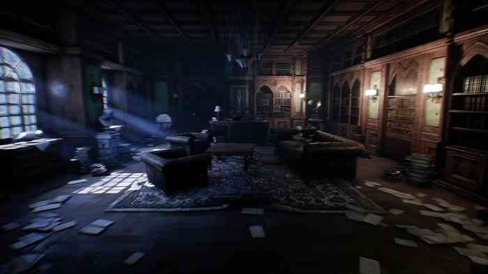
The artistic design is excellent, ominous and chilling even when there’s nothing around to actively frighten you, though this design is partially hidden away behind an awful wall of artificial noise and blurring. The actual models and textures are really stellar, making your surroundings feel like what you would expect to see in a mansion that had been home to some nasty history, though the lighting that illuminates those surroundings needs work. The actual themes explored and some of the types of horror we see are really interesting and super freaky, with a diverse range of other-worldly threats, though some are done up so much that it just kind of becomes silly. The sound design is pretty stellar, though sometimes it’s forced to make up for a scare that falls a little flat, especially in the early game. If you haven’t noticed, there’s a pattern here. Everything good about the game is wrapped up in something that drags it down into the mediocrity of the rest of the unpolished or even totally unfinished parts of the game.
I wish this was a preview of an unfinished game. I don’t want to give this game a score because it’s not ready. This feels like early beta. Did they just not take time to consider quality assurance and playtesting? I know the game has been in development for a long time, so why release an unfinished product now? Rym Games is an indie developer, so it couldn’t have been a publisher rushing the game out the door. Was it monetary pressure? Whatever the case may be, I hope to see the game improve with coming updates. Maybe they’ll even get rid of the noise that covers the screen at all times, or at least make it optional. While every game will always have things that could be improved, The Conjuring House needs to improve dramatically to become the game that it’s promising with its trailers. Unfortunately, it’s difficult to say whether Rym Games will be able to pull together enough patches going forward to really make The Conjuring House livable.
*** PC code provided by the publisher ***
The Good
- Haunting atmosphere
- Graphically solid when it works
- Truly chilling imagery
The Bad
- It’s not finished
- Horribly buggy
- Poorly optimized
- Frustrating controls

