Stellar Monarch 2 Preview
If Stellar Monarch 2 was a building, you would say that it has good bones. There’s a strong foundation in place, and the architect is clearly thoughtful and dedicated. But the whole thing’s a mess. I’ve never seen an early access game in quite as rough shape as Stellar Monarch 2, but that doesn’t mean you can’t see the promise. Taken as a proof of concept, there could be a good game in the future. To see it, we’re going to have to look beneath the messy exterior.
Houses Alike in Dignity
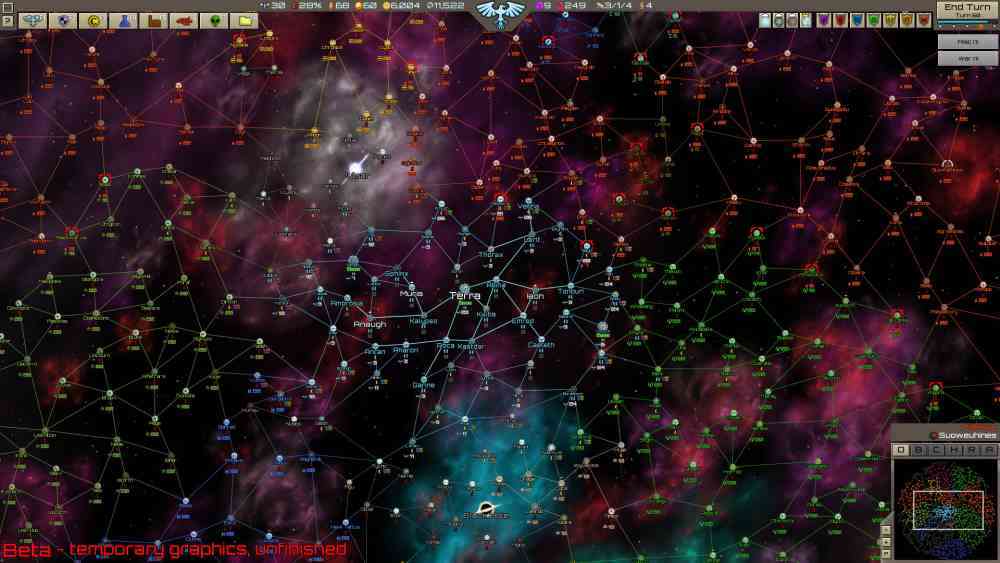
If you, like me, are a newcomer to the Stellar Monarch series, what is it all about? At first glance, it looks a lot like a galaxy-spanning 4X game. Your main view is looking down at a vast map of stars with planets. You make key choices in menus. Sometimes, a window will appear with a view of characters closer to the ground, and you make more choices from there. There are shades of Paradox grand strategy games in there, like Crusader Kings or Stellaris.

If that was all Stellar Monarch 2 aspired to be, I would be less inclined to look past some of its shortcomings. But that’s not the case. The central design ethos in Stellar Monarch 2 is that you are a ruler, not an accountant. Your choices are supposed to feel big, important. So you might order a planet to be invaded, but you won’t be responsible for managing the war. That’s why you have generals! Ostensibly, there are not production queues or troop movements to worry you.
This puts an emphasis on the grand part of grand strategy, and opens up the game to spend more time doing RPG stuff. You’ll hold court and decide the fates of worlds. Petty disputes between your royal cousins can result in the population meters plummeting. I want to say that above all else, I love this design ethos. It captures the high stakes intrigue of Dune or Deep Space Nine. It’s an excellent response to the tedium found in some strategy games. Crusader Kings is wildly popular for a reason, and doubling down on what that game does successfully should be a million dollar idea.
Revenge of the Fonts
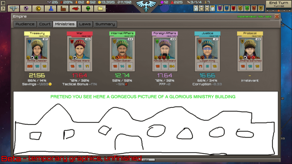
As it stands right now though, Stellar Monarch 2 is nigh unplayable, at least for me. The build I played was marked as a beta, in thick red letters. But this is a beta in rougher shape than some alpha builds I have tried. A big part of that is graphical. The art in this game has an appealing style, a throwback to the days of Command & Conquer: Red Alert. But there’s not a lot of it yet. You will frequently be looking at a wall of identical faces. They’re even all wearing the same hat.

The sameness of some of the graphics is not helped by the font choice. That was the biggest accessibility obstacle for me. There’s a lot of text to keep track of in this game and the bright, thick letters were hard for me to read. When you first load up the game, you are shown a map of the entire galaxy, fog of war be damned. And all that information is a rainbow of letters and numbers that to my brain, looked like an incomprehensible soup. Zooming very, very far in helped a little bit, but that’s not the view the game is meant to be played from.
The sound design is also something of a problem. The music has a retro charm, but it is too in your face for a ponderous strategy-RPG. It’s another overwhelming component to an already overwhelming experience. I quickly turned the music off, so I could focus on the text I was reading, particularly the tutorials, which are buried in their own little menu instead of giving you some comprehensible tips to follow.
What’s a King to a God?
That’s a lot standing between me and liking this game. But there are a couple of facts to keep in mind. The first is a reminder that this is an early access title. As a pitch document, the game is strong. The ideas are there. On top of that though, it’s important to consider that this game is the work of a single guy. That means that all of my art problems and my issues with the music also come from the same brain that came up with these excellent ideas. And it’s not like he doesn’t know the game has a long way to go. Some placeholder art is very tongue-and-cheek about the very sparse state of the game, so obviously the developer is aware. A polished game may take a lot of time and money to make, but a fresh idea is priceless.
I enjoyed my time playing Stellar Monarch 2 less than I enjoyed reading the game’s dev diary. There’s a disconnect between what the game sounds like on paper and how it actually plays. But that’s not necessarily a deal-breaker. Fonts and background music can be fixed in any old update. Strategy fans should continue to fellow Stellar Monarch 2’s development. Maybe one day it will become the game it so clearly wants to be.
***PC code provided by the developers for Review***

