3 Ways PlayDead Uses “Bad” Game Design to Make INSIDE Great
With its Nintendo Switch release on June 28, it seems as good a time as any to dig a little into the inner workings of Playdead’s INSIDE. For the uninitiated, INSIDE was initially released in 2016 after being in development for 6 years. The successor to the indie hit Limbo, it is an atmospheric masterpiece of wordless storytelling that has been constructed with painstaking attention to detail that can be seen, felt, and heard in every facet of the game. While darkness and atmosphere are common themes in the indie scene, INSIDE, despite being only 3 hours long, manages to stand out. But why? A major factor may be that INSIDE benefits from the tactful implementation of several major design decisions that are often detrimental to, and therefore excluded from, other games. Here are 3 examples of “bad” game design that actually make INSIDE great.

1) Emotional Separation from the Protagonist
Developers often use young protagonists to convey a sense of innocence and otherwise allow an audience to easily sympathize with their main character, but there’s an often-overlooked danger to flippantly making protagonists very young. Depending on the age of the intended audience, a young protagonist can risk creating a sense of detachment or separation from the player, hampering their ability to empathize with the character. INSIDE plays with this and uses it to great effect.
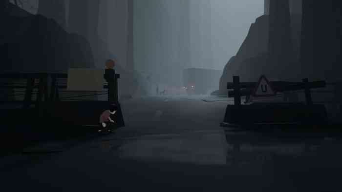
During the GameGrumps playthrough of INSIDE, Dan Avidan, after solving a puzzle, casually remarked “Oh man, this kid is smart!” before being teasingly reminded by co-host Arin Hanson that Dan was the one controlling the kid. Despite directly controlling the kid’s every action, there was enough separation that solving the puzzle was still perceived as the kid’s achievement. Additionally, the subtle responses the kid makes in response to his environment (eg. Looking at the lines of mind-controlled people), make him feel alive even under the player’s control. For INSIDE, this separation works to great effect in creating a sense of fear for or pride in, the kid in times of peril or triumph, respectively. In other games, however, this dissociation can very easily detract from a player’s valuable sense of inclusion. In Bastion, for example, a player is unlikely to sympathize with the protagonist due to the distanced perspective and the game’s unearthly setting. Without sympathy or empathy, the struggles of the game’s protagonist fall flat. However, INSIDE develops a powerful feeling of “This poor kid,” which builds tension in more hectic moments.
2) An Almost Non-Existent Soundtrack
Soundtracks make games feel full. They help bring the player into an experience by inspiring emotions that help them connect to the events happening on-screen. Particularly effective soundtracks (eg. Legend of Zelda: Ocarina of Time) can even become legendary for their vital contribution to game-feel. For these reasons, soundtracks are typically prominent features in games, especially those for whom atmosphere is critical. INSIDE, however, has none. Not in the traditional sense, anyway. INSIDE prefers to leave the player with an ominous quiet, driving home how small and alone the protagonist is. This makes way for the impact of this game’s striking sound design. Sounds add an almost tangible feeling of texture to objects in the game. The creaks and moans in the early-game’s barn tell a story of the age of the wood and how long it must have been since the farm was abandoned. Walking over damp concrete sounds so true to life that you could swear you could smell it if you tried. Perhaps the most remarkable piece of information about the sounds in INSIDE is that Danish composer Martin Stig Andersen recorded sounds being routed through a human skull, which created an ominous somber feeling that adds greatly to the atmosphere without drawing attention to itself. INSIDE boldly skips the score, and instead scores with the subtle genius of its sound design.
3) Sluggish Controls
INSIDE’s protagonist moves organically. You can feel his weight when he jumps, when he begins accelerating from a walk to a sprint, when he just barely makes a jump and has to pull himself up, and even when he dies. Abrupt changes in momentum are excellently conveyed through both animation and tactile feedback from the controller (which you should be using to play this game—ditch the keyboard for this one). The kid has inertia. The feeling of the delay between when you press jump and when the kid’s foot touches the ground, finally enabling him to take that action, is an excellent example of how this game takes realistic features that would usually be left out of games, despite their realism, because of the way it detracts from the smoothness of gameplay. Things like this are usually left out of games, and for good reason. Using an acceleration rate accurate to that of earth would make platformers miserably slow, so they improve the experience by speeding it up. Waiting to jump until the character’s feet are in position typically feels sluggish and clunky, so they allow jumping to occur instantaneously. Here, the realness of the kid’s interactions with the world make his perils feel legitimate and makes the player root for him even more.
INSIDE seems like an excellent contribution to the Switch’s ever-growing catalog of indie titles. Having never gotten a mobile port as its predecessor did, the Switch will finally offer fans a way to carry both Limbo and INSIDE with them at the same time (and the battery life to play them start to finish).