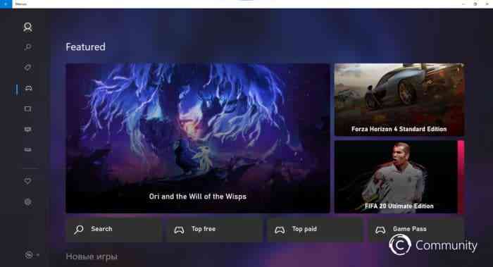
Originally Leaked on Twitter, the Modern Redesign Could Be Revealed with the New Xbox Series X
App remodels can be hit-and-miss. They either result in a flood of confusion for the sake of style, or a positive improvement in site navigation/accessibility. Recently, the internet was dazzled by some leaked screenshots provided by @wincommunity on Twitter, which unveiled a moody, minimalistic redesign of the Xbox store that was running on Windows 10. So far, people have responded well to the change, which makes sense– the new site is real dang pretty.

The redesign even has a codename, Mercury, which makes this reveal all the more humorous. Clearly, Microsoft was trying to keep this under wraps, but thanks to some clever people, we have been graced with the beauty of this secret before its due-time. The design is quite different from the current Xbox’s store, which may result in some complaints down the road. However, I would argue that the new interface is easily accessible and sleek, which should allow for an easy transition between the old and new. As speculation goes, many believe that this new interface will be available to the public with the launch of the new Xbox Series X, which means we would have to wait until next year to try it out for ourselves.
Recently, lots of apps have been trying out new looks in an effort to “get with the times” and modernize. Most notably, Facebook decided to change their online interface for desktop this spring, and the reviews were not so favourable. In a Forbes article documenting this change, John Brandon writes: “The new interface is leaner, brighter — trendier. It looks like Google and Apple got together to make a new social media app. It might just be because it’s new…but I hate it.” I hope people won’t be saying that about the new Xbox store, as I prefer the redesign. What do you think?
Source: Thurrot